


Born from my fascination with NASA’s wind tunnel testing of parachutes, Paraciphers take flight in the concept of structures that are brought to life by air, designed with function in mind. Taking cues from the movement of the inflated parachutes, these are collection of fluid forms that mimic the rhythm of flowers in the wind.
Through moments of shared refraction, reflection and shadow, connections are drawn from the character of the parachutes – and the patterns they typically display – to some of my past pieces. I hoped to capture some of those fleeting moments in the patterning of the parachute like moments of light frozen in time.
Once I began working with the parachute patterns, I saw the opportunity to add another layer of meaning. I created patterns in the fabric by encoding messages using a telegraph code and interpreting that through color. Each “parachute” has a message about radical equality and community, addressing the inadequacies of our current society. The parachutes then provide a sense of relief twice over — in their physical capacity to save and in the salvation of their messages.


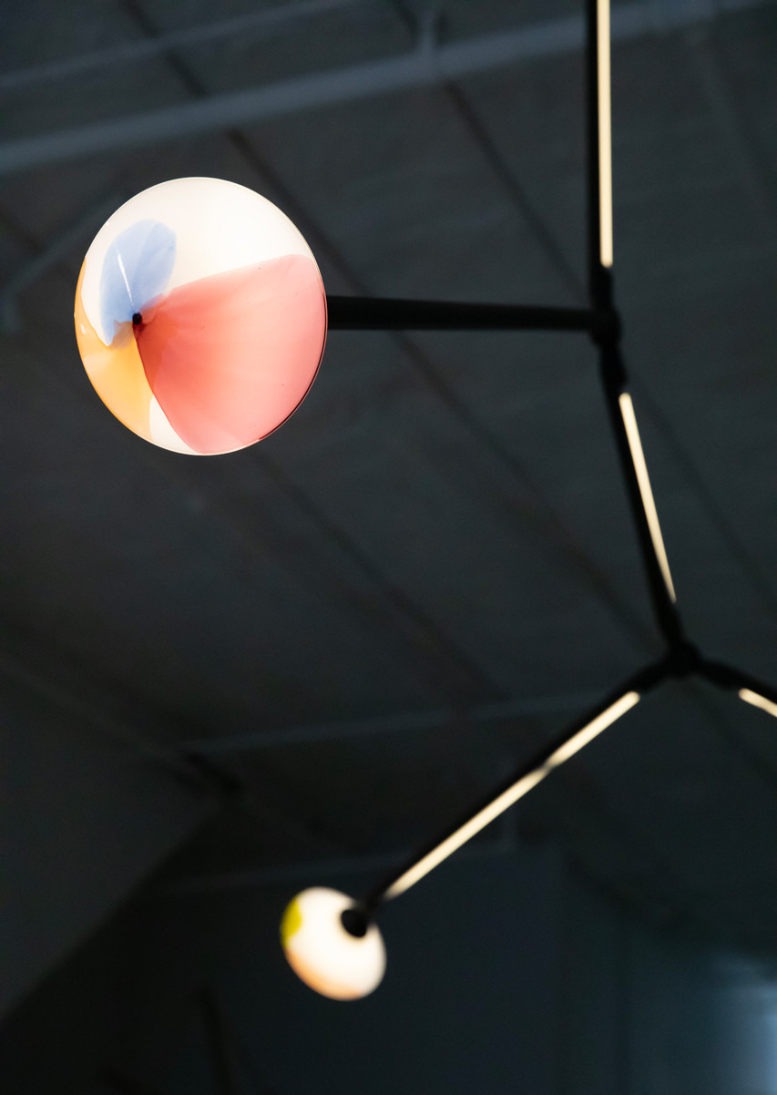


In response to the brief of The Knockoff Show, I thought immediately of the ubiquitous design of Lindsey Adelman's Bubble Chandelier because it has such a personal connection for me. My time working with Lindsey was my introduction to lighting, and my hands were very much involved while she was developing the Branching Bubble system - it was a formative time and now is very nostalgic. In this way the piece is an homage to Lindsey and a nod to my past.
Both Lindsey and I rely heavily on "systems" of parts that can be put together in a countless number of ways. This knock-off is substituting my kit of parts for hers, making analogies along the way. Her lines are tubes, my lines are the light bulbs. Her bulbs are globes, mine are the double diamond FKA Themis shapes. Her connectors are Y's and mine are hubs from the SHY fixtures.
69in x 46in x 56in H


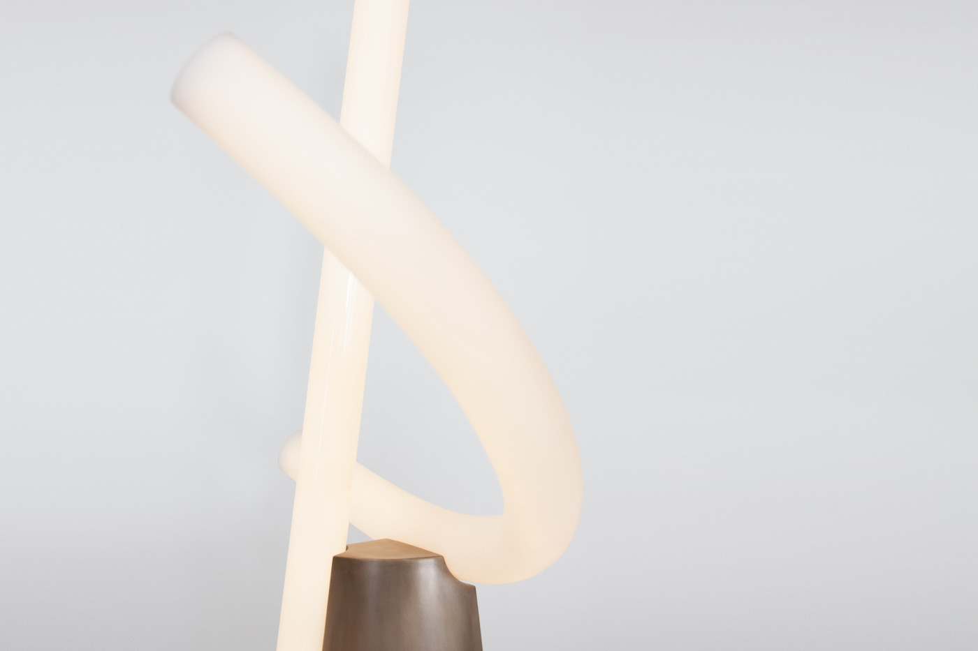
Formed using colored acrylic rods, Aries Rising Capricorn takes on a more expressive and hand-drawn quality than previous collections.
Aries Rising Capricorn originated from a sketch which was inspired by one of Keith Riley's drawings of an overflowing urn. I wanted to make lines that were personal to me, within which you can see my mark. It naturally went to fiber optics from there, finding some combination of the glowing kids toy and Paul Cocksedge's 'Pole' light. While I initially considered borosilicate tubes, I moved to acrylic rods, as it enabled everything to be more immediate and casual. I didn’t want these forms to be laboured at all, nor did I want them to be designed. I wanted to be able to decide in the moment what felt right and to let go of perfection. The acrylic rods allow me to bend, twist and play. It’s a multitude of small, local, hands-on decisions that come together as the larger composition, similar to a drawing.


Bec created a playful new series of two-off originals, which she appropriately named Gemini.


Bec Brittain and John Hogan had been wanting to collaborate together for years; Bec’s new Aries system provided a perfect armature for John’s pieces to interact with. While Bec and John both draw inspiration from celestial references, each has a different approach; Bec engineers systems from machined metal and light, while John crafts pieces out of material that has to be coaxed more than told what to do. The weight of John’s glass required Bec to re-address the formal language she had been using with Aries and build more architectural and truss-like forms. In this way it was a true collaboration in that both John and Bec were responding to each other’s vision while leaving room for their own.
Each of the three pieces is being produced in a limited edition of 10.


The Resolute collection is drawn from Bec Brittain’s solo show at The Future Perfect, her first since 2013 and the first at the New York gallery. Characterized by a new sense of confidence, the work is at once harmonious and instinctive. By introducing a new visual vocabulary, focusing on the interplay between mirrors, metals and glass, Brittain has created the essential components that can be customized in myriad ways, making up site-specific installations and audacious large scale commissions.


Kawari Crane is an extension of the Crane series, which emerged from the idea of a bronze volume and leather acting as the 'crane' lifting a glowing mass of glass. As the series has expanded, it has becomes more elemental, exploring the interaction between a grounding bronze volume and floating forms of light, most specifically in their intersections and connections. Kawari Crane is the first of the series to incorporate curved glass, inspired by the elaborate helmets of Japanese armor.


Cranes are about material: a bronze volume and leather strapping act as a crane hoisting a load of glowing glass. The dense weight of the brass can hold a comparable volume of the lighter glass, in scenarios that appear precarious but aren't due to material differences.


For Progressland, curated by Andrew Zuckerman for Chamber Gallery, Bec Brittain created a fixture inspired by the International Space Station.
A primary quality of the ISS is that of assemblage; assemblages of parts, of philosophies, of people and cultures, of governments. As one looks at the physical components of the ISS, one can begin to read into the other layers of this conglomeration, using them as keys to the full story. From a chronological approach, one can see the changes of plans, or sometimes seemingly "add-on" nature of certain elements. From a nationalistic point of view, one can see the amazing cooperation between governments and cultures that wouldn't otherwise be collaborating. From a functional approach, one can see that it is also an assemblage of instruments and tools with more human concerns of habitability.
MOU (Memoranda of Understanding), of course takes its cues from the form of the ISS, but also from the key concept of assemblage. The entire piece is comprised of smaller modules in repetition, to harken back to the "add-on" nature that has been such a part of the ISS' making. Moreover, these modules, while all brass, have used different manufacturing methods, as a way to represent the different philosophies which are inherent to the different elements of the station. Finally, in order to highlight the more human-centric areas from the larger, more noticeable mechanisms of the spacecraft, different finishes were used for each of the axes: the mechanical axis is a perfect polished nickel, while the human axis is a darker, hand-worked finish. The human axis is also accented by two hand blown glass globes, representing areas of habitability.


The Vault series uses concrete bases to visually and structurally anchor thin curving lines in space, punctuated with LED tubes and ceramic and wood elements. The widely varying scale of the pieces prompts a different interaction with the viewer; some pieces are human scale and are easily perceived as objects, while others become architectural, creating space for one to walk through. Additionally, Vault plays with variation of palette to create different moods, from somber to whimsical.


The Crane series was initially conceived as a large scale floor standing project, for which these are smaller scale maquettes. Cranes are about material: bronze as the crane hoisting a load of glowing glass. The dense weight of the brass can hold a comparable volume of the lighter glass, in scenarios that appear precarious but aren't due to material differences.


Mercury is an installation using 35 separate strands to create a screen of light, stone and leather. Each strand which comprises Mercury uses three different elements: LED tubes, oversized stone beads, and massive suede tassels. The LED tubes use Brittain’s signature hardware, all custom designed, fabricated, and finished. The stone beads are honed from 4 different semi-precious stones: rainbow obsidian, snowflake obsidian, zebra jasper and black agate. Each suede tassel is hand made by Brittain from many yards of suede, detailed with chrome oil tanned leather, forming elegant and opulent statements. These three elements are strung together in a manner resembling making a necklace, using the large tassel to ground the strand both literally and figuratively as it pours onto the floor.
While Mercury has at it’s core these single strands, it is the composition of them which showcases its internal characteristics and contrasts. The form the installation takes highlights the massive opacity of the leather forms through repetition and scale. In contrast to this grounding element, the upper elements of beads and light give the piece a light airiness that seems to float above the heaviness of the tassels. In its entirety as an installation, the piece creates a screen of light.
The colorway of the piece explores variations within a narrow field and also takes into account the metaphysical properties of the stones. Ultimately, this is a piece which is about the subtlety and exploration of darkness and light, of opacity and lightness, and of opulence, and harmony.


For a special exhibit at Le Bon Marche during Paris Design week in 2015, Brittain created a grouping of standing beams, each with unique cast concrete bases and leather and brass details.


The collaboration between Bec Brittain and Hilda Hellström stems from an appreciation of each other's contrasts, and a belief that they could be melded and compliment each other.
Hilda's practice is very hands on, embracing the natural variance in her process and her materials, resulting in each piece being slightly different than the others. She works volumetrically, building up forms with her signature and unique use of Jesmonite and then manipulating each to her vision. Bec, by contrast, works in a more engineered way, designing intricate parts for manufacture. She views these pieces as her “kit of parts” from which she creates a multitude of forms. Bec approaches form less volumetrically than Hilda, using LED tubes as lines of light to draw with, or the repetition of planar forms to create a volume.
It is these differing approaches to form and process which gives an opportunity for these new pieces – Bec's more airy and linear sense of form creates a space in which Hilda's more volumetric pieces are framed and showcased. Hilda's more organic sensibility balances Bec's more precise and mechanical one.